
Earlier this spring, I worked on a project to visualize music. Since it was a term project, I got to put a lot of work and energy into it, and naturally I wanted to share it with the world. Unfortunately, if you’ve ever done any work in academia, you know that a lot of work has to stay secret due to competition. Luckily, I no longer plan to publish a paper on this topic. Instead, I can finally share the results here! Meet JuxtaMIDI: a MIDI file visualization dashboard.
Table of Contents
Motivation
As I mentioned, in the spring, I worked on a data visualization project for a grad school course. In it, we were asked to form teams to develop a term project. Naturally, we were allowed to work on just about anything as long as it was data visualization related. Since I have a strong interest in music, I figured I’d try my hand at that.
Once we got into our teams, I worked with my partner, Stephen Wu, to flesh out some ideas for visualizing music. Ultimately, we decided to put together a MIDI file visualization dashboard.
MIDI, for those that might not know, is a music file format which thinks of music in terms of events. In other words, we don’t have to deal with any signal processing for visualization purposes. All the data we need is already at the note level. Of course, MIDI limits our application space, but it allowed us to create our dashboard a lot quicker.
Essentially, we wanted to create a dashboard which would allow musicians to see differences in MIDI files. In particular, we figured musicians could use it as a part of their practice regiment. In other words, they would record themselves playing a song then compare it directly to some expert recording. Given enough time, they would be able refine their technique until they mastered the song.
After a few months, we had a working dashboard which could be used to compare any number of MIDI recordings. That dashboard became known as JuxtaMIDI.
If you’d like to take a look at it, feel free to head on over to the JuxtaMIDI website hosted on GitHub pages. Naturally, you’ll need some MIDI files for demonstration purposes, so I’ve hosted a few in the homepage. There you can also find the sample report which outlines this project a bit more formally.
Design
The overall design of the JuxtaMIDI dashboard has 5 main panels of which 3 feature plots of the MIDI data (click to expand):

In the following subsections, we’ll take a look at each panel in action.
Notes Played Plot
In the largest panel at the top of the dashboard, you’ll find the notes played panel:

Essentially, this is a plot of what notes are being play at what time. Specifically, the notes are organized from lowest to highest along the y-axis while time is listed on the x-axis. In this case, time is in in MIDI ticks. Although, it would be nice to see time in seconds.
To make this plot more interesting, we actually have a song playback feature which allows the user to play their recording against this plot. To track progress through the song, we use a vertical line. To help you remember which song was playing, we’ve encoded the time marker with the song’s color (more on that later):

In addition, since songs tend to have a lot of notes, we gave this pane a scroll bar. That way, the plot would be a little easier to read.
Finally, each note has a popup which renders when you hover over it:

In it, you’ll see the note’s name, start time, velocity, and duration as well as which track it’s from.
Note Frequency Plot
Below the notes played plot on the left, you’ll find the note frequency plot:

As the name suggests, the note frequency plot indicates how many times a note was played—with no relation to duration. Specifically, the x-axis features each note that appeared, sorted by the most frequent note. Meanwhile, the y-axis indicates the number of times a note was played.
The main idea behind this plot was to give a quick overview of wrong notes. As you can see in the example above, there are two recordings being compared. In this case, there are a few note counts that differ: C3, G4, F#4, F#3, C#3, and A3. To highlight that difference, we fade all pairs with the same frequency.
Finally, each bar has a bit of interactivity:

Specifically, if we hover over a bar, we should see the note list alongside its frequency and which track it came from.
Note Velocity Plot
To the right of the note frequency plot, you’ll find the note velocity plot:

Basically, this plot features the velocity (i.e. volume) of the music over time. On the y-axis, we feature the velocity. Meanwhile, on the x-axis, we feature the time in the same units as the notes played plot (i.e. ticks).
Like the notes played plot, this plot also features a progress marker:

Theoretically, we would use this marker to identify the current dynamic level (e.g. piano, forte, etc.) of the piece. Of course, it’s a bit hard to identify that here, but that’s the idea.
Of all the plots, this one is the most ambiguous. Ideally, we wanted to be able to show dynamics, so we could compare swells in recordings. Unfortunately, we were never really able to get something that resembled dynamics. In our current plot, we show the range of velocities by drawing upper and lower bounds for the velocities at any given time. Of course, we’d want some way to represent dynamics with a single curve.
Song Management Pane
On the left side of the dashboard, you’ll find the song selection pane:

Initially, the dashboard is empty. When you want to add a song to you it, you click the “Add MIDI” button, and you’ll be prompted to select a MIDI file from your computer.
Once a song is loaded in, you’ll see all the graphs populate with the new data. In addition, a new element will be added to the song management pane: the new song. Notice how the background of the song has a color. That color matches all elements related to that song in each of the three plots.
In addition to providing an encoding mechanism for each song, this pane also features individual controls for each song. For example, the slider on the bottom left toggles the song on and off all plots. In this case, if we turn the Mario-Few.mid song off, we’ll remove the dark blue markings from each plot:

Likewise, hitting the play button on a song causes the time-based plots to feature a time marker as mentioned previously.
Meanwhile, the pencil icon can be used to change the name of the song. For example, a file lacking a descriptive name could be renamed in this interface for clarity:

Finally, the trash bin icon can be used to completely remove a track from the dashboard. To get the track back, the user would have to reload it.
At this time, song colors are assigned in a fixed order based on the order in which they’re loaded into the dashboard. If we were to add another song, the next color in the sequence would be green:

In the future, it would be nice to be able to select colors. For now, this process is automated for the user.
Plot Selection Pane
Finally, we included a section of the UI dedicated to isolating each plot for full screen viewing purposes:
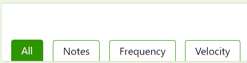
Each button can be used to view a different plot. For example, if we want to blow up the notes pane, we could click the notes button. As a result, the notes pane will become the focus of the dashboard:

As you can imagine, each of the plots can be blown up in this manner for your viewing pleasure.
Implementation
For anyone interested, I’m happy to share how this dashboard was built. Of course, you’re welcome to take a look at the code yourself over on GitHub.
In terms of tech, we used vanilla JavaScript, HTML, and CSS—no frameworks. Specifically, the layout of the dashboard was built using CSS grid. Meanwhile, the plots were generated in D3 and the interactivity elements were added using Popper and Tippy. From a MIDI parsing perspective, we used the midi-parser library. Then, for playing MIDI files, we used the MIDIPlayer library.
Together, these tools were used to generate the JuxtaMIDI dashboard. Since it has been awhile since I’ve touched the code, I don’t feel comfortable sharing too many details. In addition, the code was hastily pieced together, so there are a lot of opportunities for bug fixes and overall improvements.
That said, we put together a slightly more official report as a part of the submission if you’d like to check that out. In it, you’ll see a lot of the same information here. In addition, however, you’ll also see a case study and several references.
Support
Hey, if you thought this project was cool, feel free to let me know. I currently don’t plan on working on it anymore, but I’d be happy to maintain it if anyone wanted to see it grow.
As always, thanks for sticking around. If you’d like to see more content like this hop on my newsletter or become a patron. Finally, check out some these books on data visualization on Amazon (ad):
- Storytelling with Data: A Data Visualization Guide for Business Professionals
- Data Visualization: A Practical Introduction
Also, now that you know I’m interested in music, feel free to check out my niche site, Trill Trombone. In my spare time, I’ve been trying to build up a small income generating website covering one of my hobbies, music. Show it some love!
Finally, check out some of these related articles:
- Why My Second Hackathon Was Better Than My First
- How a Class Ruined Computer Graphics
- The Problem With Working in Teams
Otherwise, thanks for stopping by! See you next time.
Recent Posts
Hope y'all are having a good summer! Clearly, I've been spending much of mine continuing to reflect on the state of generative AI. Today, I want to talk about how the way we talk is starting to match...
Unc is back to gaming, and I need to clown on Overwatch's 6v6 mode. What do you mean I'm in masters? This cannot be a serious game mode.