While I was taking some time for myself in May, I thought it would be fun to take a look at my course evaluations for the last semester. After all, COVID-19 really messed up teaching, and I figured it would be interesting to see if it had any effect on my end of semester reviews. As a result, I put together a few visualization for your perusal.
Of course, I won’t bury the lead! I did see almost a universal drop in scores this semester. However, the drop feels really small in comparison to previous semester, so I can’t really complain. There were definitely things I could have done better to manage the transition.
Table of Contents
Data Collection
Before we dig into the actual results, I figured I’d take some time to talk about data collection. Specifically, I want to talk about how I got my course evaluations.
For me, course evaluations come in the form of a 10-question survey. Each question shares a statement about instruction, and students are asked to decide how much they agree with that statement from 1-5 (Likert scale). Here is the list of statements:
- The subject matter of this course was well organized
- This course was intellectually stimulating
- This instructor was genuinely interested in teaching
- The instructor encouraged students to think for themselves
- The instructor was well prepared
- The instructor was genuinely interested in helping students
- I learned a great deal from this instructor
- The instructor created an atmosphere conducive to learning
- The instructor communicated the subject matter clearly
- Overall, I would rate this instructor as
Then, each question is reported as a class average against three cohorts: your department, your college, and the university. In addition, each question is broken down by the percentage of students who gave a certain answer.
Finally, a cumulative report shares all the high-level metrics for every semester of teaching. For example, I taught for four semesters, so my cumulative report has four rows of data. You can find each PDF in the following reflections:
- Reflecting on My First Semester of Teaching
- Reflecting on My Second Semester of Teaching
- Reflecting on My Fourth Semester of Teaching
- Reflecting on My Fifth Semester of Teaching
Otherwise, let’s talk data cleaning.
Data Cleaning
To get the data in a useful form, I chose to turn whatever table I could find into a CSV. For example, here’s a copy of the mean scores for all questions:
| Subject | Course | Class | Term | Q1 | Q2 | Q3 | Q4 | Q5 | Q6 | Q7 | Q8 | Q9 | Q10 |
|---|---|---|---|---|---|---|---|---|---|---|---|---|---|
| CSE | 1223 | 26319 | AU 18 | 4.13 | 4.38 | 4.72 | 4.75 | 4.50 | 4.72 | 4.53 | 4.53 | 4.44 | 4.63 |
| CSE | 1223 | 8281 | SP 19 | 4.48 | 4.48 | 4.68 | 4.65 | 4.61 | 4.71 | 4.58 | 4.53 | 4.55 | 4.77 |
| CSE | 2221 | 35160 | AU 19 | 4.57 | 4.39 | 4.87 | 4.83 | 4.74 | 4.96 | 4.74 | 4.87 | 4.78 | 4.91 |
| CSE | 2221 | 11278 | SP 20 | 4.03 | 4.45 | 4.72 | 4.69 | 4.66 | 4.83 | 4.62 | 4.55 | 4.48 | 4.76 |
In addition to this table, I created an additional table which mapped the questions from above to their question number. That way, I could easily map Q1 to its appropriate label.
To actually use both of these tables, I created pandas dataframes:
import pandas

# Load data and take a peek
df = pd.read_csv("https://raw.githubusercontent.com/jrg94/doodles/master/teaching-evals/mean-evals-by-term.csv")

# Load question labels
labels = pd.read_csv("https://raw.githubusercontent.com/jrg94/doodles/master/teaching-evals/question-labels.csv")
With the data intact, it was just a matter of playing around with visualization.
Data Visualization
At this point, I had all the data I could ever need, so I decided to start by looking at a broad overview of the data in a time series. In other words, I decided to plot each question over the four terms to see if there were any obvious trends:
# Plot time series of all questions over 4 terms
results = df.plot(
    subplots=True,
    x="term",
    y=["q1", "q2", "q3", "q4", "q5", "q6", "q7", "q8", "q9", "q10"],
    figsize=(15, 15),
    ylim=(4,5),
    title=list(labels.values[0]),
    legend=False,
    sharex=True,
    sharey=True,
    layout=(5,2)
)
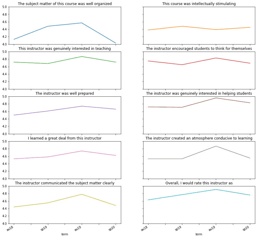
As a result, I got this cool grid of trends:

Here, we can see that almost every question showed a noticeable dip in ranking over the previous semester. In some cases, I received my worst score yet for that question. For example, Q1 was at an all time low which makes sense—online learning was significantly less organized.
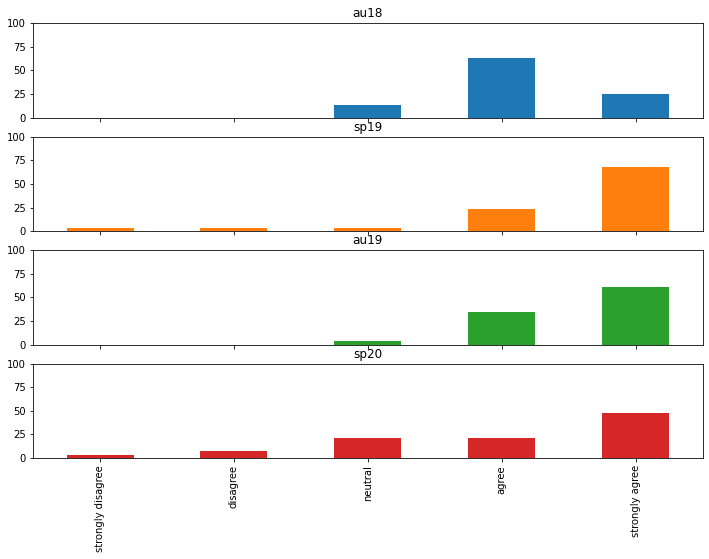
At this point, I got interested in looking at the distributions which make up these data points. For example, I thought it would be cool to look at the distribution for Q1 over the four semesters:
# Plot distributions of all four terms
filt = dists[dists["question"] == "q1"][
  ["term", "strongly disagree", "disagree", "neutral", "agree", "strongly agree"]
].set_index("term").T
results = filt.plot(
    kind="bar",
    subplots=True,
    figsize=(12, 8),
    ylim=(0,100),
    legend=False
)
The result is this nifty set of distributions which show the breakdown of each score:

Now, I think this is interesting because almost every distribution is centered around “strongly agree” except when I first started teaching. However, this past semester, students seemed a bit more unsure than previously. In other words, the distribution is more flat than we’ve seen in the past.
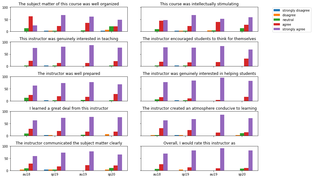
After putting this plot together, I thought it would be interesting to merge the results onto a single plot. That way, we’d be able to compare the distributions for every question. Here’s the code that got that done:
fig, ax = plt.subplots(nrows=5, ncols=2, figsize=(12, 8), sharex=True, sharey=True)
width=.15

i = 1
for row in ax:
  for col in row:
    filt = dists[dists["question"] == f"q{i}" ][
      ["term", "strongly disagree", "disagree", "neutral", "agree", "strongly agree"]
    ].set_index("term").T
    col.set_title(labels.values[0][i - 1])
    for j in range(5):
      if j == 2:  # centers the tick
        col.bar(np.arange(4) + width * j, filt.iloc[j], width, label=filt.index[j], tick_label=filt.T.index, align="center")
      else:
        col.bar(np.arange(4) + width * j, filt.iloc[j], width, label=filt.index[j], align="center")
      handles, axes_labels = col.get_legend_handles_labels()
    i+=1
fig.legend(handles, axes_labels, loc="lower right", bbox_to_anchor=(1.15, .8))
fig.tight_layout()
And, this generated the following plot:

I really like this plot because it gives our trends a bit more context. For instance, it makes certain distributions pop out immediately. Luckily, we got a chance to look at Q1 already, but I think Q2 is pretty interesting as well. After all, the distributions are a bit more messy.
That said, I can’t really see any obvious impacts of online learning on the results when the data is presented this way. Regardless of the semester, my students overwhelmingly support me. In other words, perhaps the first set of trends are a bit misleading and any fluctuations are just due to noise.
Exploring Data
Overall, I wasn’t really planning to learn anything profound by doing this analysis. Instead, I was more interested in playing around with the data to see what sort of trends I could find. Obviously, this wasn’t a controlled experiment, so it wouldn’t be fair of me to make any assumptions about the results.
That said, I’d be really interested in seeing how things shook out for other people. Did you also notice a downward trend in your reviews? Why not share them with me on Twitter:
Also, if you’re interested, I dumped all the code into a Jupyter notebook for your perusal . Feel free to load it up and make changes!
Otherwise, thanks for sticking around! Here are some other data visualization related resources that you might enjoy:
Likewise, here are some data viz resources from Amazon (ad):
- Storytelling with Data: A Data Visualization Guide for Business Professionals

- Fundamentals of Data Visualization: A Primer on Making Informative and Compelling Figures

Thanks again for hanging out. I appreciate your time!
Recent Posts
The infamous "name a woman" challenge has expanded into a speed run where you name 100 women. I took the challenge and failed miserably (hence why I'm hiding it behind the paywall).
It's July 2024, and I have three chapters of my dissertation drafted! Two more and we'll be ready to defend.

