As a blogger, I find myself constantly fighting with search engines to find content that’ll stick. That said, writing that kind of content isn’t always fun, so I decided to have some fun for once. Today, I’ll be sharing with you some data I pulled from Hum and how I managed to visualize it in Python.
Table of Contents
What Is Hum?
Hum is a tool that I was persuaded into buying at Verizon in 2019. It’s basically a glorified On-Board Diagnostics (OBD) reader which syncs to an app on your phone. Overall, it’s pretty cool. It tracks your driving and also gives you a heads up when things start going wrong in the vehicle.
I got it back in 2019 because I had a history of dealing with old vehicles, and I wanted a little extra peace of mind. It’s now midway through 2021, and I have a much nicer car that my parents sold me, a 2015 Toyota RAV4. Previously, I had a 1998 Jeep Grand Cherokee until 2018 when I got rid of it and took joint ownership of my wife’s 2003 Hyundai Elantra. As a result, I haven’t had to rely on Hum much. However, we’re still paying for it.
After switching vehicles, the Hum app stopped working on my phone. That said, it still was giving me a driving score every time I went out. Randomly the other day, I got the ambition to fix the app to which I was surprised by a very nice new interface. Now, the Hum app shows you all kinds of cool stuff like driving history and fuel usage.
Thanks to pushes for internet privacy, apps like Hum have to provide ways for you to download, or at least delete, the data they track about you. Naturally, Hum is no different. As I was stumbling around the dashboard, I noticed a button for exporting my driving history. You better believe that I got to downloading it. In the remainder of the article, I’ll be talking about what that data looks like and how I decided to make use of it.
Data Overview
Exporting your driving history in Hum is a bit of a pain. Rather than downloading everything in one go, you have to use their calendar interface to select a range of dates. I didn’t have much luck with this interface, so I downloaded all my data in yearly chunks: 2019, 2020, and 2021. The data we will be working with today is from 2020 since it’s the only complete year I have on record.
When you receive the data, it comes in a really easy to read CSV format. In fact, if you’re on Windows like I am, you can pop it open with Excel to view it like a spreadsheet. In general, I was quite surprised by how clean the data was because I’ve dealt with a lot of export data in the past that is almost completely unintelligible (I’m looking at you iMotions).
At any rate, when you open up the spreadsheet, you’re greeted with 12 columns of data as follows:
- Start Time
- End Time
- Total Distance (mi)
- Trip Time
- Idle Time
- Start Address
- End Address
- Top Speed (mph)
- Average Speed (mph)
- Average mpg
- Fuel Used
- Tags
For obvious reasons, I’ve omitted a handful of these columns in my analysis—namely the address and tags fields. That said, everything else is real data that you can find for yourself at GitHub here.
The remainder of the file is about 600 rows worth of trips. To be honest, I don’t remember driving that much during a pandemic, but apparently I was quite busy!
All that said, I’m not sure there is much else to say about the data. It’s pretty straightforward, so let’s get to the visualization.
Data Visualization
When it comes to data visualization, there are a lot of different ways to make sense of data. I’m not personally interested in doing any fancy analysis. Since we have some time series data, I figured we could go ahead and plot it directly. However, before we can do that, we need to do a bit of data loading and cleanup, so let’s go ahead and do that first.
Loading Data
As a huge fan of Python, I figured I’d use that for visualization today. After all, I find Python pretty great for data analysis. If I get some time, maybe I’ll pick up Julia in the future.
With Python in mind, loading our data is a matter of preference. Personally, I’m a fan of Pandas as a way of storing columns of data, so I used it’s read_csv() function to get us started:
import pandas as pd

df = pd.read_csv("data/2020-driving-history.csv")
In short, this takes the CSV data and turns it into a Pandas DataFrame which looks something like this:
           Start Time          End Time  ...  Average mpg Fuel Used (gal)
0       1/2/2020 9:29     1/2/2020 9:46  ...           22        0.506750
1      1/2/2020 10:52    1/2/2020 11:08  ...           30        0.355444
2      1/2/2020 11:18    1/2/2020 11:20  ...           46        0.001178
3      1/3/2020 11:28    1/3/2020 11:58  ...           26        0.742469
4      1/3/2020 12:57    1/3/2020 13:01  ...           13        0.022694
..                ...               ...  ...          ...             ...
626  12/29/2020 13:28  12/29/2020 13:32  ...           16        0.039890
627  12/29/2020 14:10  12/29/2020 14:27  ...           24        0.254120
628  12/29/2020 14:52  12/29/2020 15:03  ...           31        0.148522
629  12/29/2020 15:18  12/29/2020 15:29  ...           22        0.199592
630  12/30/2020 12:17  12/30/2020 12:22  ...           11        0.029581
With the data loaded, it’s a matter of getting the data in the proper format. Let’s do that next.
Data Cleaning
Unfortunately, the read_csv() function is not smart enough to automatically convert the spreadsheet data to the right types. By that, I mean that currently some of the columns are strings when it would be more useful to have them in some other format. For example, our “Start Time” column is current stored generically as an object:
0         1/2/2020 9:29
1        1/2/2020 10:52
2        1/2/2020 11:18
3        1/3/2020 11:28
4        1/3/2020 12:57
             ...
626    12/29/2020 13:28
627    12/29/2020 14:10
628    12/29/2020 14:52
629    12/29/2020 15:18
630    12/30/2020 12:17
Name: Start Time, Length: 631, dtype: object
Ideally, we’d like this column to be represented as a DateTime object, so we can manipulate the dates as needed. To do that, Pandas has a fancy to_datetime() function. As a result, we can overwrite the current object column with the DateTime column as follows:
df["Start Time"] = pd.to_datetime(df["Start Time"])
df["End Time"] = pd.to_datetime(df["End Time"])
While we’re at it, we should probably fix up any remaining columns like these. For instance, the Trip Time and Idle Time columns might be better suited as TimeDelta objects as follows:
df["Trip Time"] = pd.to_timedelta(df["Trip Time"])
df["Idle Time"] = pd.to_timedelta(df["Idle Time"])
And to make it clear, here’s what all four columns looked like before cleaning:
           Start Time          End Time Trip Time Idle Time
0       1/2/2020 9:29     1/2/2020 9:46   0:16:38   0:01:26
1      1/2/2020 10:52    1/2/2020 11:08   0:15:36   0:00:59
2      1/2/2020 11:18    1/2/2020 11:20   0:01:39   0:00:14
3      1/3/2020 11:28    1/3/2020 11:58   0:30:10   0:05:10
4      1/3/2020 12:57    1/3/2020 13:01   0:03:38   0:01:06
..                ...               ...       ...       ...
626  12/29/2020 13:28  12/29/2020 13:32   0:04:02   0:00:30
627  12/29/2020 14:10  12/29/2020 14:27   0:17:06   0:03:47
628  12/29/2020 14:52  12/29/2020 15:03   0:11:07   0:00:57
629  12/29/2020 15:18  12/29/2020 15:29   0:10:31   0:00:43
630  12/30/2020 12:17  12/30/2020 12:22   0:04:36   0:00:29
And here’s what they look like after cleaning:
             Start Time            End Time       Trip Time       Idle Time
0   2020-01-02 09:29:00 2020-01-02 09:46:00 0 days 00:16:38 0 days 00:01:26
1   2020-01-02 10:52:00 2020-01-02 11:08:00 0 days 00:15:36 0 days 00:00:59
2   2020-01-02 11:18:00 2020-01-02 11:20:00 0 days 00:01:39 0 days 00:00:14
3   2020-01-03 11:28:00 2020-01-03 11:58:00 0 days 00:30:10 0 days 00:05:10
4   2020-01-03 12:57:00 2020-01-03 13:01:00 0 days 00:03:38 0 days 00:01:06
..                  ...                 ...             ...             ...
626 2020-12-29 13:28:00 2020-12-29 13:32:00 0 days 00:04:02 0 days 00:00:30
627 2020-12-29 14:10:00 2020-12-29 14:27:00 0 days 00:17:06 0 days 00:03:47
628 2020-12-29 14:52:00 2020-12-29 15:03:00 0 days 00:11:07 0 days 00:00:57
629 2020-12-29 15:18:00 2020-12-29 15:29:00 0 days 00:10:31 0 days 00:00:43
630 2020-12-30 12:17:00 2020-12-30 12:22:00 0 days 00:04:36 0 days 00:00:29
As far as I’m concerned, the remaining columns all behave correctly as numbers, so there is no need to clean them up. As a result, we can now start thinking about visualization.
Data Manipulating
When it comes to visualizing data, one of the more challenging tasks is getting the data in a good form for plotting. However, to know the correct form, we need to know what we want to plot.
As mentioned previously, the goal of this task was to plot all of these columns over time. That way, we could see things like fuel mileage over the course of a year or trip time over the year.
Fortunately, there isn’t a ton we have to do to get our data in a format we would like. In fact, we could plot most of these columns directly over time.
However, there is one main problems. First, I don’t like that there could be multiple trips in a single day. Ideally, I would like to see daily travel over time. As a result, we need to resample the data, so we can see all of our metrics on a daily basis rather than on a trip basis.
Fortunately, there is a resample() function for this. All we have to do is provide a time series column (e.g., “Start Time”) and a resample interval (e.g. Daily = D). However, this isn’t enough. We also need to specify how we want the rows combined if there are multiple on the same day. For example, if we have three trips in one day, we need to combine “Trip Time” using addition. However, that won’t work for a column like “Top Speed”
Thankfully, we don’t have to apply a single function to all of our columns—though there is nothing really stopping us. Instead, we can use the aggregate function as follows:
daily_resample = df.resample("D", on="Start Time").agg(
    {
        "Total Distance (mi)": sum,
        "Top Speed (mph)": max,
        "Trip Time": sum,
        "Idle Time": sum,
        "Average Speed (mph)": pd.DataFrame.mean,
        "Average mpg": pd.DataFrame.mean,
        "Fuel Used (gal)": sum
    }
)
This creates a completely new DataFrame with the “Start Time” column representing days instead of trips as follows:
            Total Distance (mi)  Top Speed (mph)  ... Average mpg Fuel Used (gal)
Start Time                                        ...
2020-01-02            22.036566             72.0  ...   32.666667        0.863373
2020-01-03            48.391473             73.0  ...   21.000000        1.920710
2020-01-04             0.000000              NaN  ...         NaN        0.000000
2020-01-05           252.217031             83.0  ...   17.714286        8.864113
2020-01-06            42.548606             75.0  ...   22.000000        1.511232
...                         ...              ...  ...         ...             ...
2020-12-26             4.588555             36.0  ...    9.428571        0.370681
2020-12-27             0.383976             21.0  ...    9.000000        0.044857
2020-12-28             0.000000              NaN  ...         NaN        0.000000
2020-12-29            28.563449             52.0  ...   19.555556        1.347983
2020-12-30             0.320848             22.0  ...   11.000000        0.029581
Unfortunately, even at this point, we can’t plot all this data over time. In fact, there are two columns causing us problems: “Trip Time” and “Idle Time.” As far as I can tell, Matplotlib cannot handle TimeDelta objects. As a result, I converted them directly to seconds for plotting:
daily_resample["Trip Time"] = daily_resample["Trip Time"].dt.total_seconds()
daily_resample["Idle Time"] = daily_resample["Idle Time"].dt.total_seconds()
That said, our data is now ready to go! Let’s plot some time series data.
Data Plotting
Normally, when I have some raw time series data like this, my first thought is to make a line chart. That way, I can see how the data changes over time.
However, I just recently learned about area plots which are like line plots but have the area under the curve colored in. I don’t really see this as much different than a line plot, but I like how it looks. So, I gave it a go as follows:
daily_resample.plot.area(subplots=True)
This gives us the following plot for each column of data:
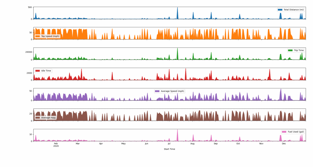
As you can see, each plot is given a color with a legend. Across the x-axis, we see the months of the year.
One thing that I think jumps out right away is the drop in travel once the pandemic began in the US around March 2020. At that time, I remember switching my grocery schedule from weekly to biweekly and otherwise not leaving the apartment.
If I keep scanning, I can see a major bump in travel in mid-July. If I recall correctly, that was my sister’s baby shower—though it could also be the day that we moved. Then there are a few more notable bumps in November and December, presumably for Thanksgiving and Christmas. Outside of that, I’d say we were relatively behaved during the pandemic.
Having had a chance to stare at the data for a bit, I thought it would be cool to make another area plot containing only “Trip Time” and “Idle Time” because I figured those would be interested to see side-by-side:
daily_resample.plot.area(y=["Idle Time", "Trip Time"])
And, of course, here’s the plot for that.
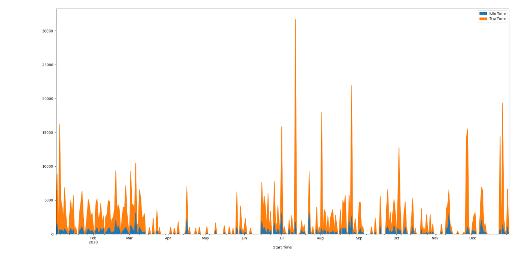
Overall, it doesn’t look like I spend much time idling relative to actually driving. Though, the ratio definitely varies over time.
And because I’m a weirdo, I decided to merge all of the Hum data into a single spreadsheet to see all of my trips over time. Here’s what that looks like:
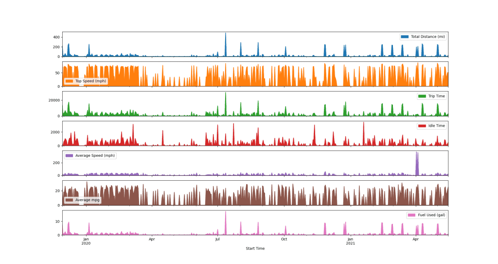
Of course, this very quickly indicates a problem in the data provided by Hum. There are two major outliers in the “Average Speed” data in April. I took a peek, and they read over 1000 mph which is clearly not true. Accounting for those data points, here’s the revised plot.
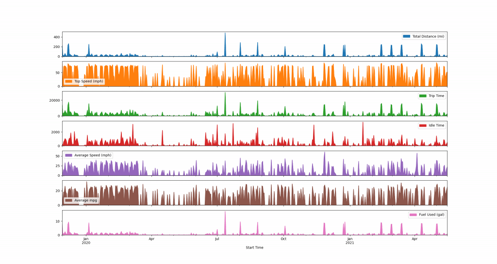
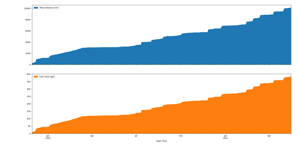
Overall, I find these plots really interesting, and I’d love to know what you’d like to see me do with this data. For instance, I had this idea to generate a cumulative plot to show total distance driven and fuel mileage over the last three years. Turns out, it’s pretty easy to do:
cumulative_daily_resample = daily_resample.cumsum()
cumulative_daily_resample.plot.area(y=["Total Distance (mi)", "Fuel Used (gal)"], subplots=True)
That generates the following plot:
Do you have other cool ideas like this? Let me know! Or, fork the repo, and make your own.
Making More Data Viz
I don’t plan to make a series out of this style of content, but I do really enjoy generating data viz from real world data. Interestingly, I also collect a considerable amount of data about myself. For example, I have a ton of Fitbit data that I wouldn’t mind exploring here.
If you enjoyed this sort of thing and would like to see more articles like it, check out the following articles:
- Can You Actually Return Multiple Values From a Function in Python?
- 11 Python Practice Problems for Beginners
- Python 3.9 Features That Will Make Your Life Easier
Keep in mind that I write about Python all the time, so check the tag often for new posts.
Also, here are some resources from the folks at Amazon (#ad):
- Effective Python: 90 Specific Ways to Write Better Python
- Python Tricks: A Buffet of Awesome Python Features
- Python Programming: An Introduction to Computer Science
With that said, that’s all I have for you today! Thanks for hanging out. Take care!
Recent Code Posts
You would think I'd seen it all in my teaching career, but a new bug just showed up in one of my labs: one that involves using == to compare Integer objects in Java.
Contrary to my piece from a couple years ago, I'm actually coming out in favor of incorporating loop invariants in computer science education—albeit with more of a focus on reasoning than formal...

