As someone who has been doing quite a bit of data visualization over the last few years, I’ve never actually worked up the courage to write about it. Well, today is a good day to start talking about line plots in Python. In particular, we’ll be using the Matplotlib module, and we’ll be focusing on three types of data: lists, DataFrames, and subscriptable objects.
As a quick overview, one way to make a line plot in Python is to take advantage of Matplotlib’s plot function: import matplotlib.pyplot as plt; plt.plot([1,2,3,4], [5, -2, 3, 4]); plt.show(). Of course, there are several other ways to create a line plot including using a DataFrame directly.
In the remainder of this article, we’ll look at various ways to plot a line, and I’ll even share some bonus content. For example, how to label the axes of a line plot.
Table of Contents
Problem Description
Recently, I’ve been doing a lot of data analysis for a research project that leverages various sources of data. Here are a few examples of that data:
- Eye tracking metrics
- Keyboard and mouse input
- Electrodermal activity
Together, these sources of data give us a better idea of what’s going on. Naturally, I can’t share exactly what the details look like, but I’m happy to talk about how we performed a lot of our analysis.
In particular, most of the data we collected could be plotted directly. For example, the electrodermal activity can be plotted to generated line plots that look like this:
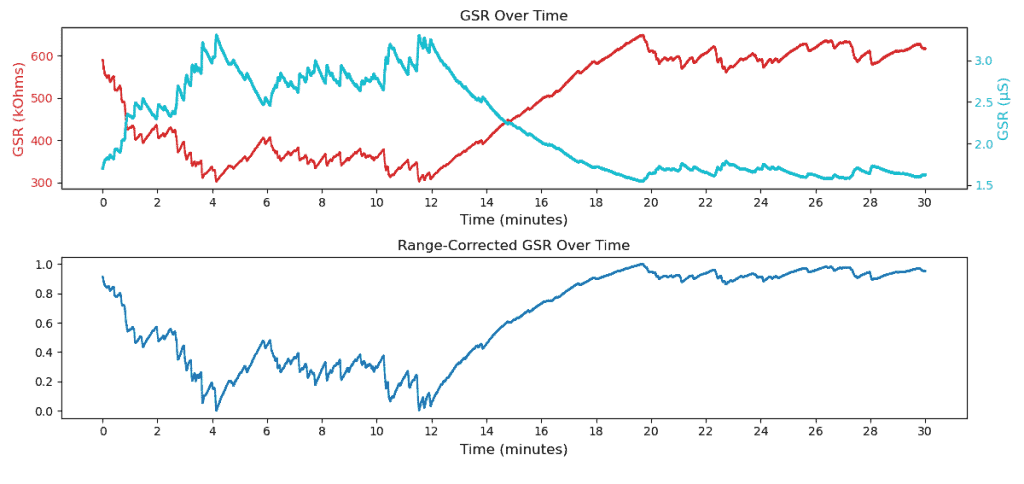
Of course, the question today becomes: “how do we actually go about generating these plots?” Well, don’t worry! All that is covered below.
Solutions
Typically in this series, we’d take a look at several ways to accomplish the same thing. Of course, this time is no different. That said, I wanted to preface the following solutions by saying that we’re largely going to be doing to same thing repeatedly. The only difference is that we’ll be trying to plot lines with data in different formats (e.g. lists, dataframes, etc.). Enjoy!
Make a Line Plot Using Lists
Perhaps the easiest way to generate a line plot is to put together two lists of numbers of equal length. Then, it’s a matter of leveraging the plot function of Matplotlib:
import matplotlib.pyplot as plt

x = [1, 3, 5, 7, 9]
y = [2, 4, 6, 8, 10]
plt.plot(x, y)
plt.show()
If you run this code, you’ll get a simple plot like this without any titles or labels:
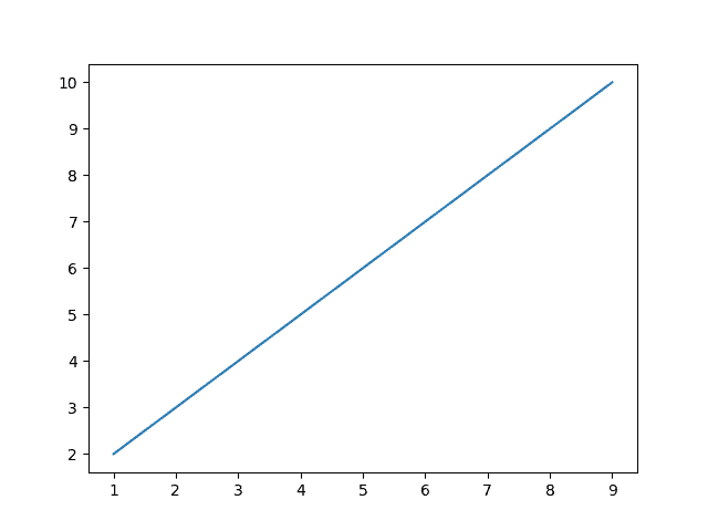
Naturally, this works because Matplotlib allows us to pass it two sequences as the x- and y-coordinates. In other words, this plotted (1, 2), (3, 4), (5, 6), (7, 8), and (9, 10).
Keep in mind that for this to work we have to import the pyplot module of Matplotlib. In this case, we give the alias plt which we use to call the plot() function.
If we wanted a more interesting line, it would be as quick as changing the two lists:
import matplotlib.pyplot as plt

x = [1, 3, 5, 7, 9]
y = [2, -6, 3, 8, 14]
plt.plot(x, y)
plt.show()
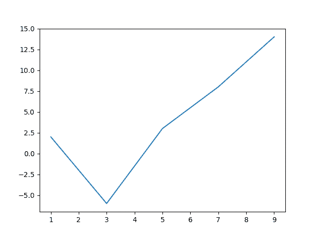
Which generates the following plot:
And, if you were feeling particularly adventurous, you could plot both:
import matplotlib

x = [1, 3, 5, 7, 9]
y = [2, 4, 6, 8, 10]
plt.plot(x, y)

y = [2, -6, 3, 8, 14]
plt.plot(x, y)

plt.show()
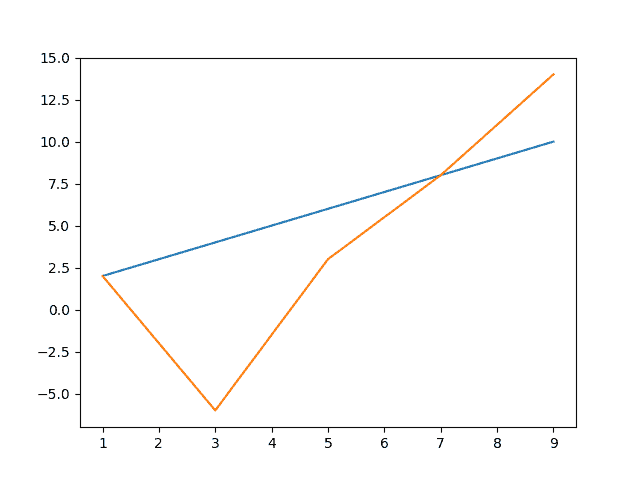
Which generates this cool little plot where the blue line is our first plot and the orange line is our second plot:

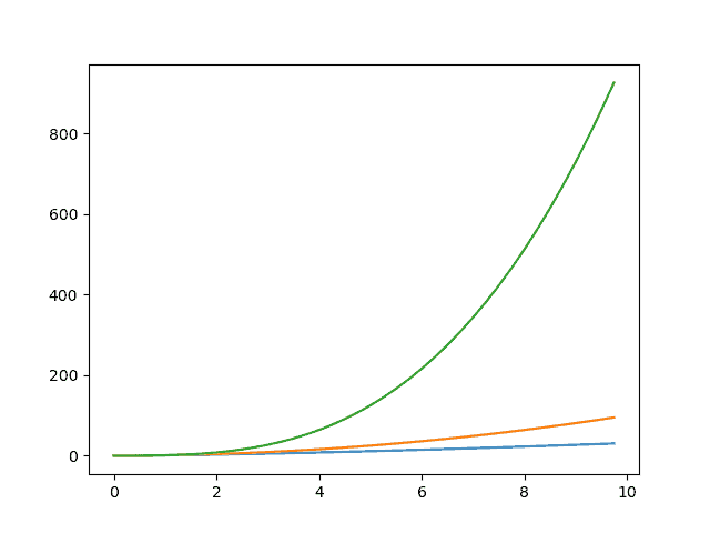
As you can probably imagine, this solution works well for similar data structures like Numpy arrays. For example, here’s a Numpy array used to generate several different plots:
import numpy as np

x = np.arange(0, 10, .25)

plt.plot(x, x**1.5)
plt.plot(x, x**2)
plt.plot(x, x**3)

plt.show()
Once we’ve generated x, we can manipulate directly as if it were a scaler. As a result, we get the following plot:
Stick around until after the solutions to learn how to add labels and whatnot to these plots. For now though, we’re going to explore how to create similar plots using a different data structure.
Make a Line Plot Using a DataFrame
While putting together two lists is fine for simple problems, it’s more likely that you’ll be dealing with large amounts of data. For example, I’m working with an enormous spreadsheet that contains dozens of columns and thousands of rows.
Naturally, when dealing with this type of data, it’s common to take advantage of Pandas, a data manipulation library. In particular, Pandas includes a data structure called a DataFrame which stores data in labeled columns.
To create one of these DataFrames, we have a free options. That said, I think the quickest way to create one would be to create a dictionary first:
data = {
  "x": [1, 3, 5, 7, 9],
  "y1": [2, 4, 6, 8, 10],
  "y2": [2, -6, 3, 8, 14]
}
Here, I took the same lists from above but gave the two sets of y-coordinates their own names. Now, we can create a DataFrame as follows:
import pandas as pd
df = pd.DataFrame(data=data)
Once we have a DataFrame, we can call plot() on the DataFrame directly (though we’ll need Matplotlib to actually display the plot):
import matplotlib.pyplot as plt

df.plot()
plt.show()
Unfortunately, this doesn’t give us exactly what we want:
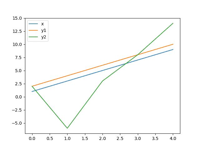
The reason for this is that DataFrames have two axes called columns and indices. By naming our data in the dictionary, we created columns. However, the indices were created for us. Take a look:
>>> df
   x  y1  y2
0  1   2   2
1  3   4  -6
2  5   6   3
3  7   8   8
4  9  10  14
To get around this, we have two options: overwrite the index with column x or plot two columns explicitly. Let’s try option two first:
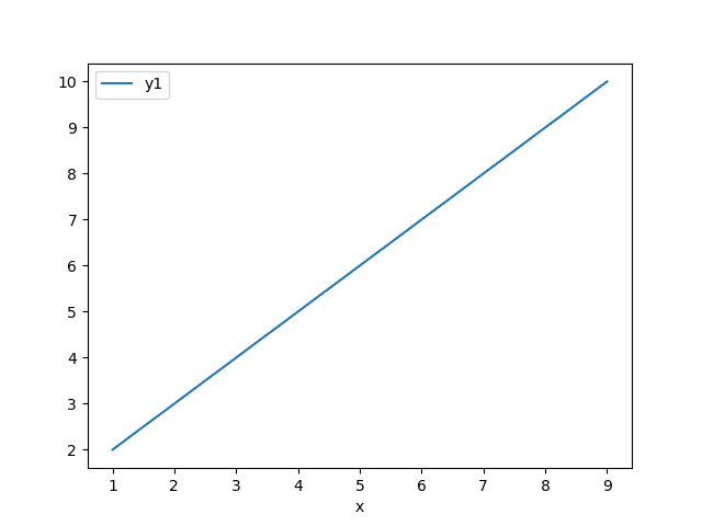
Unfortunately, unlike with Matplotlib, we can’t get both lines to plot by calling the function twice; that will generate two figures. Instead, we’ll have to get an axis object:
ax = plt.gca()  # shorthand for "get current axis"
df.plot(x="x", y="y1", ax=ax)
df.plot(x="x", y="y2", ax=ax)
plt.show()
As a result, we’ll get both lines as well as a handy legend as well as a labeled axis:
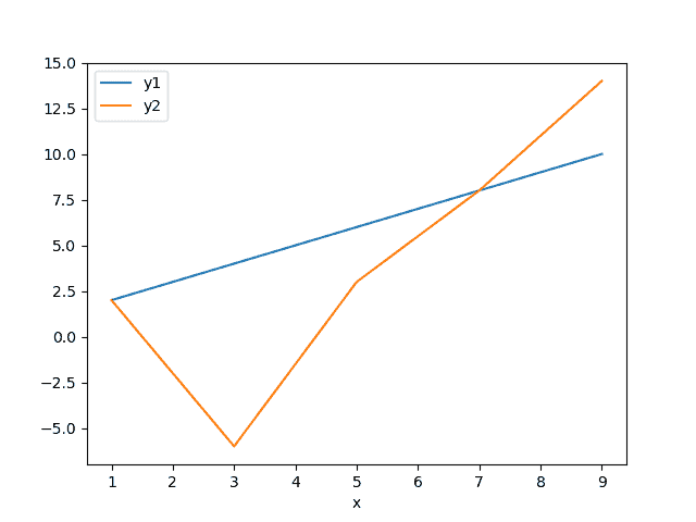
That said, I find this a bit clunky. After all, both of these lines share the same x-coordinates. It would be a lot nicer if our DataFrame used these as the indices instead. To do that, we’ll need to start over:
x = [1, 3, 5, 7, 9]
data = {
  "y1": [2, 4, 6, 8, 10],
  "y2": [2, -6, 3, 8, 14]
}
df = pd.DataFrame(data=data, index=x)
With this new DataFrame, our underlying data looks like this:
>>> df
   y1  y2
1   2   2
3   4  -6
5   6   3
7   8   8
9  10  14
As a result, we’ll get the plot we want directly with the following code:
df.plot()
plt.show()
And, here’s the result:
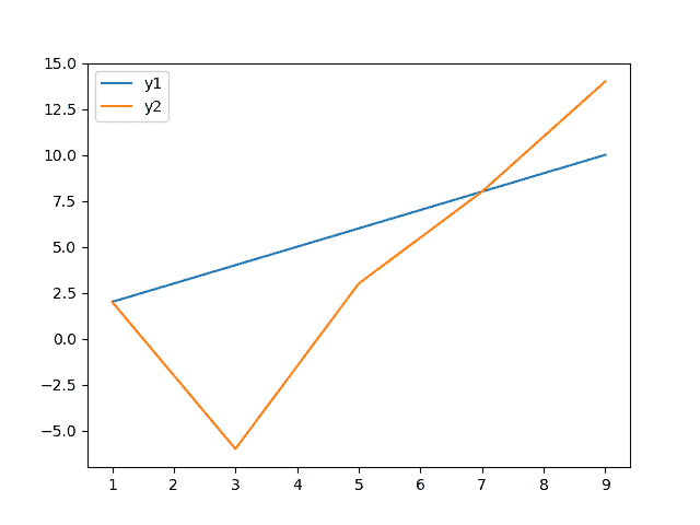
How cool is that?! Now, imagine how easy it would be to plot data like this from a spreadsheet. We could have dozens of columns and thousands of rows, and we’ll still be able to get nice plots like this in just a couple lines of code—and people wonder why I love Python so much.
Make a Line Plot With an Object
One thing I find really interesting about Matplotlib is that we don’t even need data in any proper format. In fact, as long as our data can be accessed by some keyword, we should be good to go. Specifically, the object has to be subscriptable which means that we can access the data using the following syntax: obj[keyword].
As an example, I’ll make a simple data class to demonstrate:
class MyData():
  def __init__(self, x, y):
    self.x = x
    self.y = y
  def __getitem__(self, item):
    return getattr(self, item)
This is almost certainly not best practice, but basically this class allows us to store two variables: x and y. What makes this class special is that we can access these variables in two ways:
data.x
data["x"]
We can do this because of the definition of the __getitem__() function. Essentially, we’ve turned our object into a read-only dictionary.
Naturally, we can use this class to store the exact same lists from before:
d1 = MyData([1, 3, 5, 7, 9], [2, 4, 6, 8, 10])
d2 = MyData(d1.x, [2, -6, 3, 8, 14])
Beyond the fact that d2 has an alias to the same x-value, we should be ready to plot. To do that, we’ll need to take advantage of a particular form of the plot() function which accepts two keywords and a data object:
import matplotlib.pyplot as plt

plt.plot("x", "y", data=d1)
I got a particularly weird warning when I tried to do this, but it seemed to work anyway:

For reference, here’s the warning:
Warning (from warnings module):
  File "<pyshell#82>", line 1
RuntimeWarning: Second argument 'y' is ambiguous: could be a format string but is in 'data'; using as data.  If it was intended as data, set the format string to an empty string to suppress this warning.  If it was intended as a format string, explicitly pass the x-values as well.  Alternatively, rename the entry in 'data'.
Feel free to chime in if you know what’s going on here. I couldn’t find anything during a quick search. Otherwise, here’s how we go about plotting both data objects:
plt.plot("x", "y", data=d1)
plt.plot("x", "y", data=d2)
plt.show()
Which results in a plot we’ve seen several times already:
All that said, I’m not sure how practical this last solution is. According to the documentation , “All indexable objects are supported. This could e.g. be a
 dict , a
, a pandas.DataFrame or a structured numpy array.” Certainly there are other data structures that fit the bill, but I think it’s a stretch to say that examples like mine are common.
With that said, these are the three main solutions I wanted to check out today. If you have other data you’re trying to plot, let me know, and I’ll add a section here. In the meantime, however, we’re going to move on to plot formatting. In particular, we’re going to talk about how to add axes labels.
Bonus: Plot Formatting
I couldn’t possibly show you how to plot data without showing you how to add proper labels. After all, what good is a plot without information one the axes?
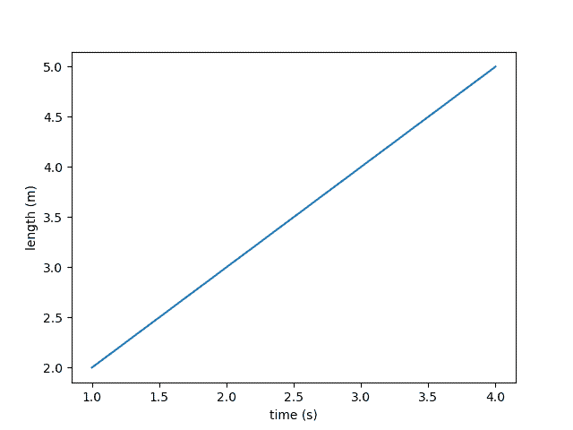
Fortunately, labeling is pretty straightforward. In fact, there are two functions built right into Matplotlib: plt.xlabel() and plt.ylabel(). Unfortunately, there’s more nuance to this as you add figures and plots. That said, here’s the quick and dirty way to get it done:
>>> import matplotlib.pyplot as plt
>>> plt.plot([1,2,3,4], [2,3,4,5])
[<matplotlib.lines.Line2D object at 0x0CC00EC8>]
>>> plt.xlabel("time (s)")
Text(0.5, 0, 'time (s)')
>>> plt.ylabel("length (m)")
Text(0, 0.5, 'length (m)')
>>> plt.show()
Naturally, when I ran this, I got the following plot with proper axes labels:
Unfortunately, I’m not sure if this solution will work for all of the code snippets in this article. In fact, sometimes you need to work with the axes directly as we saw with the first DataFrame example. That said, that’s probably another entire article’s worth of content.
As it turns out, Matplotlib is pretty complex, so you can really get lost in the weeds trying to put together a plot. As a result, I’ll probably put together some additional articles because the current resources aren’t great.
If there’s a certain thing you want to do with a plot, let me know! I’ll try to turn it into an article. In the meantime, let’s move on to the challenge.
Challenge
At this point, we’d usually take a look at the performance metrics for the various solutions, but I’m not sure of the best way to go about it (or if it would even make sense). Instead, let’s talk about our #RenegadePython challenge for the day.
Given what we’ve covered today, what sort of cool data would you like to explore? Once you’ve picked something out, be sure to share the image with us on Twitter! Here’s mine:
If you don’t have Twitter, we’re always open to submissions on GitHub . Otherwise, you’re welcome to try any of our many challenges in this series.
A Little Recap
At long last, we’ve reached the end of this party. As usual, here are all the solutions in one place:
import matplotlib.pyplot as plt
import numpy as np
import pandas as pd

# Generate a line plot from two lists
x = [1, 3, 5, 7, 9]
y = [2, 4, 6, 8, 10]
plt.plot(x, y)
plt.show()

# Generate a line plot from a DataFrame
x = [1, 3, 5, 7, 9]
data = {
  "y1": [2, 4, 6, 8, 10],
  "y2": [2, -6, 3, 8, 14]
}
df = pd.DataFrame(data=data, index=x)
df.plot()
plt.show()

# Generate a line plot from a subscriptable object
class MyData():
  def __init__(self, x, y):
    self.x = x
    self.y = y
  def __getitem__(self, item):
    return getattr(self, item)

d1 = MyData([1, 3, 5, 7, 9], [2, 4, 6, 8, 10])
d2 = MyData(d1.x, [2, -6, 3, 8, 14])
plt.plot("x", "y", data=d1)
plt.plot("x", "y", data=d2)
plt.show()
Due to the complex nature of data analysis and plotting, I couldn’t cover everything. That said, if there is something you’d like to see in this article or in future articles, let me know. You can always contact my by email (jeremy.grifski@therenegadecoder.com) or through Twitter .
.
Of course, if this is all you needed, I’d appreciate it if you took the time to check out my list of ways to grow the site. Right now, I’m trying to grow my Discord, but you’re welcome to check out my Newsletter or YouTube channel. Anything helps!
Likewise, here are some related articles:
- Using Python to Visualize the Potential Effects of COVID-19 on Course Evaluations
- How to Open a File in Python: open(), pathlib, and More
And, here are some useful resources from Amazon (ad):
- Effective Python: 90 Specific Ways to Write Better Python

- Python Tricks: A Buffet of Awesome Python Features

- Python Programming: An Introduction to Computer Science

Otherwise, thanks for checking out the site. I hope you’ll come back soon!
Recent Code Posts
In growing the Python concept map, I thought I'd take today to cover the concept of special methods as their called in the documentation. However, you may have heard them called magic methods or even...
Today, we're expanding our new concept series by building on the concept of an iterable. Specifically, we'll be looking at a feature of iterables called iterable unpacking. Let's get into it!

