This might seem like an extremely niche issue, but it’s a problem I struggled to solve with the existing resources on the internet. As a result, I’m here to share how I got it done!
Table of Contents
- Background
- Data Format
- Loading Semester Data With Pandas
- Plotting Raw Data With Plotly
- Processing Our Data Into Semesters
- Ordering the Semesters on the X-Axis
- Accounting for Missing Data
- Pitfalls and Future Concerns
Background
Currently, I teach software development courses at the college level. As a part of that job, I store a lot of data, from grades to student evaluations. All of these data are time series, but not in the way we usually think of time series. At least in my mind, time either shows up as a timestamp in the form of some date and time or as intervals since the start of an event–both of which are pretty easy to manage.
In my case, these data are on the scale of semester to semester, and we don’t really have great numerical tools for these types of data. Instead, they tend to fit a variety of categories such as seasons. In other words, we typically communicate the “first” semester of the academic year as the “fall semester” and the “second” semester as the “spring semester.” In addition, some folks take a third semester in the summer and even a fourth “semester” during winter break.
While all of these categories are technically time series data, I don’t know of any tools that handle them innately. As a result, we have to resort to more annoying methods of data collection and analysis. For example, we could store our semester data using numbers (e.g., 1 for fall and 2 for spring), since these numbers are already sortable. However, I think this technique leaves a lot to be desired. After, where does summer fit? Is it the 3rd semester?
Another technique is to supply a dummy date for each semester. For instance, maybe a date in December could be used to track all fall semesters. Meanwhile, a date in May could be used to track all Spring semesters. Personally, I don’t really love this choice either because the date is completely arbitrary. However, dates are very much supported by just about any data analysis tool, so it’s a nice compromise.
That said, I like my data as clean and informative as possible (and consequently, as intentional and non-arbitrary as possible). Therefore, I opted to record each semester the way anyone in a semester-based job would: one column for the season and another column for the year (e.g., Spring, 2019). Unfortunately, this leads to many, many problems which can be solved, as I’ll show you in this article.
Data Format
I hinted at it already but just to be extremely thorough, I store all of my course-related data in comma-separated files called CSVs. This is usually my go-to for data storage because it’s plaintext and can be versioned easily. Also, most of the data analysis tools I use like Pandas and Plotly support CSVs out-of-the-box, so they’re a nice data format.
At any rate, to capture the semesters in a CSV, there are basically two options. Create a single column for semesters as follows:
Semester,Final Grade
Autumn 2023,87.2
Autumn 2023,91.3
Autumn 2023,64.7
Spring 2023,81.1
Spring 2023,86.4
Spring 2023,92.2
Autumn 2022,88.7
Autumn 2022,95.0
Autumn 2022,56.9
This is a great data format for plotting because the semesters are already as you expect them. However, I somewhat prefer the following setup:
Season,Year,Final Grade
Autumn,2023,87.2
Autumn,2023,91.3
Autumn,2023,64.7
Spring,2023,81.1
Spring,2023,86.4
Spring,2023,92.2
Autumn,2022,88.7
Autumn,2022,95.0
Autumn,2022,56.9
By separating the two, we get a categorical column and a numerical column. And with Pandas, the two columns can be combined fairly easily. Separating the single semester column into two columns is a bit more work. As a result, the type of data we’ll be working with in this article is the latter.
Loading Semester Data With Pandas
With our data as a CSV, we can load it in as follows:
import pandas as pd

data = pd.read_csv("data.csv")

print(data)
Here, the CSV we created, which is named “data.csv”, is sitting in the same folder as our script. When run, this code produces the following output:
   Season  Year  Final Grade
0  Autumn  2023         87.2
1  Autumn  2023         91.3
2  Autumn  2023         64.7
3  Spring  2023         81.1
4  Spring  2023         86.4
5  Spring  2023         92.2
6  Autumn  2022         88.7
7  Autumn  2022         95.0
8  Autumn  2022         56.9
That is how you know everything was loaded correctly!
Plotting Raw Data With Plotly
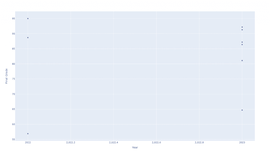
In general, there are a lot of ways of plotting the data above. For simplicity, I just want to plot the grade data as a scatter plot over time. To do that, we’ll make use of Plotly Express. However, what you’ll immediately notice is that there are no good ways to plot this data. With dataframe as-is, we don’t have a lot of options for x-axes. In the example below, we try plotting by year:
import pandas as pd
import plotly.express as px

data = pd.read_csv("data.csv")

plot = px.scatter(
    data,
    x="Year",
    y="Final Grade"
)

plot.show()
This produces a rather unappealing plot with a particularly strange x-axis:
We can somewhat improve this plot by coloring the points by season:
import pandas as pd
import plotly.express as px

data = pd.read_csv("data.csv")

plot = px.scatter(
    data,
    x="Year",
    y="Final Grade",
    color="Season"
)

plot.show()
Which generates the following plot:
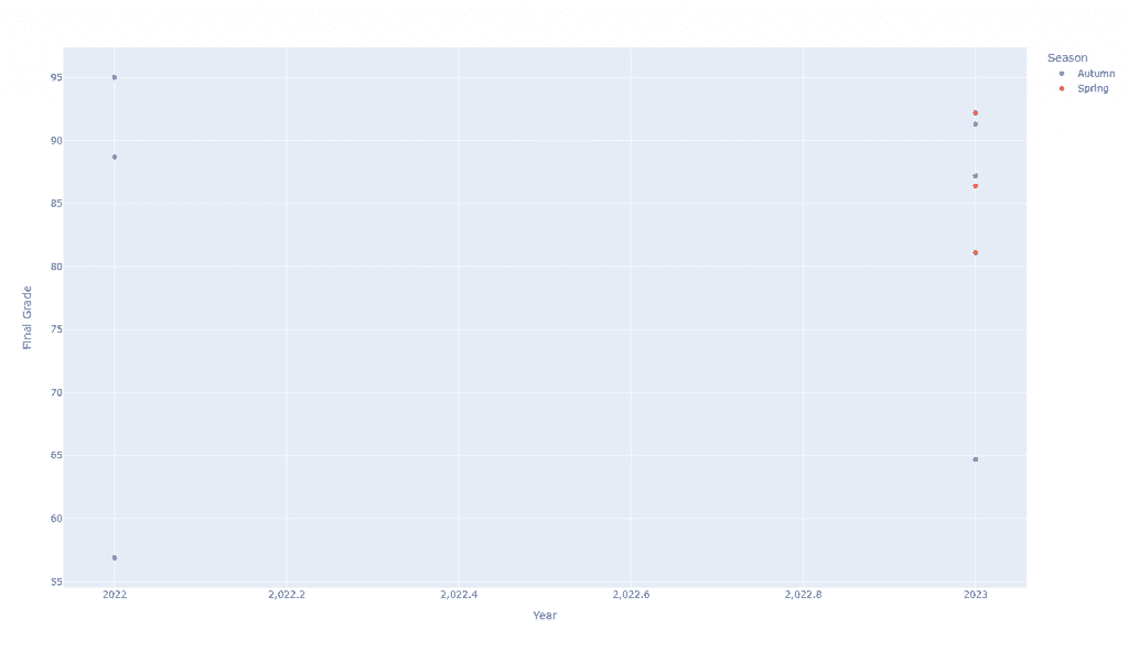
Of course, this is not really what we want, right? It would be much, much nicer to see the semesters across the x-axis. So, what if we swapped the x-axis out for season?
import pandas as pd
import plotly.express as px

data = pd.read_csv("data.csv")

plot = px.scatter(
    data,
    color="Year",
    y="Final Grade",
    x="Season"
)

plot.show()
This creates an even more ugly plot as follows:
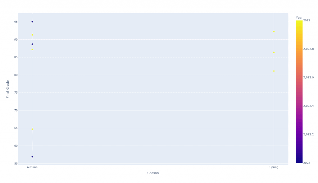
Hopefully, you can see that we need to do a bit more work to get what we actually want to see.
Processing Our Data Into Semesters
Previously, I mentioned that you can have a single column of data for each semester. Rather than doing that, we’ve opted for a two-column setup. But don’t worry, it’s really easy to combine the two columns:
import pandas as pd

data = pd.read_csv("data.csv")

data["Semester"] = data["Season"] + " " + data["Year"].astype(str)

print(data)
Here’s the resulting dataframe:
   Season  Year  Final Grade     Semester
0  Autumn  2023         87.2  Autumn 2023
1  Autumn  2023         91.3  Autumn 2023
2  Autumn  2023         64.7  Autumn 2023
3  Spring  2023         81.1  Spring 2023
4  Spring  2023         86.4  Spring 2023
5  Spring  2023         92.2  Spring 2023
6  Autumn  2022         88.7  Autumn 2022
7  Autumn  2022         95.0  Autumn 2022
8  Autumn  2022         56.9  Autumn 2022
Now, we can try plotting with the semester as the x-axis:
import pandas as pd
import plotly.express as px

data = pd.read_csv("data.csv")

data["Semester"] = data["Season"] + " " + data["Year"].astype(str)

plot = px.scatter(
    data,
    x="Semester",
    y="Final Grade"
)

plot.show()
Interestingly, this produces a plot that is very, very close to what we want:
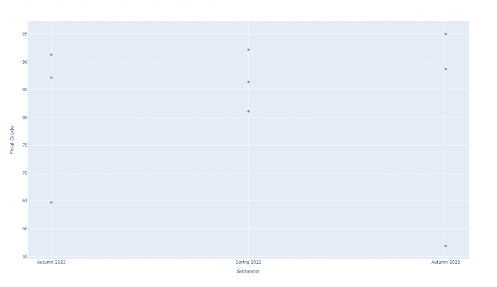
Of course, the reality is that we’ll be spending the bulk of our time tuning this plot to be exactly how we want it.
Ordering the Semesters on the X-Axis
At this point, we have a plot where the semesters are correctly on the x-axis. However, they’re in the incorrect order. There are basically two ways to solve this problem. On one hand, we could sort our dataframe, so the data appears in the correct order. On the other hand, we could make use of the category_orders feature of Plotly. We’ll start with the latter:
import pandas as pd
import plotly.express as px

data = pd.read_csv("data.csv")

data["Semester"] = data["Season"] + " " + data["Year"].astype(str)

plot = px.scatter(
    data,
    x="Semester",
    y="Final Grade",
    category_orders={"Semester": ["Autumn 2022", "Spring 2023", "Autumn 2023"]}
)

plot.show()
Using category_orders, we can explicitly state the order of the semesters, which gives us the plot we want:
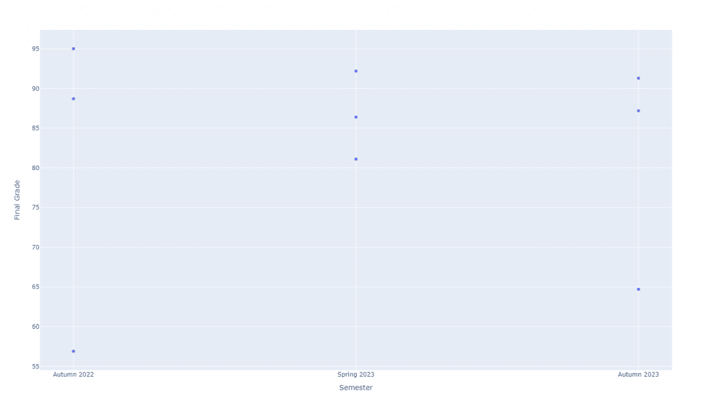
Unfortunately, however, this requires that you know how many semesters of data are included in your dataset. Therefore, you might be tempted to sort your dataframe. This is possible, but requires some work:
import pandas as pd
import plotly.express as px

data = pd.read_csv("data.csv")

data["Semester"] = data["Season"] + " " + data["Year"].astype(str)

data = data.sort_values(by="Season", ascending=False).sort_values(by="Year")

plot = px.scatter(
    data,
    x="Semester",
    y="Final Grade"
)

plot.show()
Basically, what we did here was first sort the dataframe by season in descending order. The reason for that is Autumn actually comes after Spring, so we want Autumn to appear last in the order of the semesters. We then sort the dataframe again by year according to their natural ordering. The result is the exact same plot we had above.
However, fair warning! There are some major pitfalls with this solution.
First, dataframe sorting is not “stable”. This means that the second sort may not respect the order of the first sort. Therefore, I’d recommend adding the “kind” parameter, which let’s you choose a sorting algorithm. I would specifically select “stable”, but I believe “mergesort” is also stable.
Second, sorting as we’ve done it does not account for addition semesters like summer terms. I believe there is a way to specify a categorical series, so you could automatically sort the seasons in some expected order. However, I haven’t toyed with that quite yet.
Third, the dataframe may be missing data. In my exact experience, there were semesters where I didn’t teach. As a result, there were holes in the data that did not show up in the plot. Personally, I like to visually see the gaps by showing space in the semesters where I wasn’t teaching, so sorting alone wasn’t enough.
As a result, we’ll talk about how to account for many of the pitfalls listed here in the next section.
Accounting for Missing Data
Let’s suppose we have a different dataset which is missing a semester or two of data:
Season,Year,Final Grade
Autumn,2023,87.2
Autumn,2023,91.3
Autumn,2023,64.7
Spring,2023,81.1
Spring,2023,86.4
Spring,2023,92.2
Autumn,2022,88.7
Autumn,2022,95.0
Autumn,2022,56.9
Spring,2021,68.1
Spring,2021,91.3
Spring,2021,90.3
If we plot it using our most recent approach, we end up with the following plot:
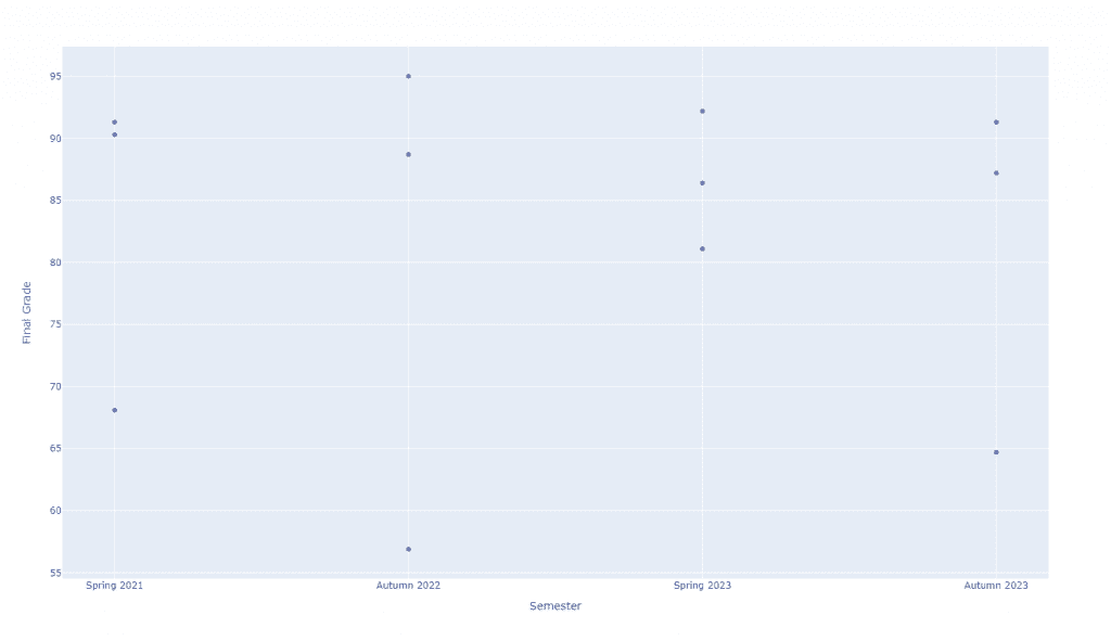
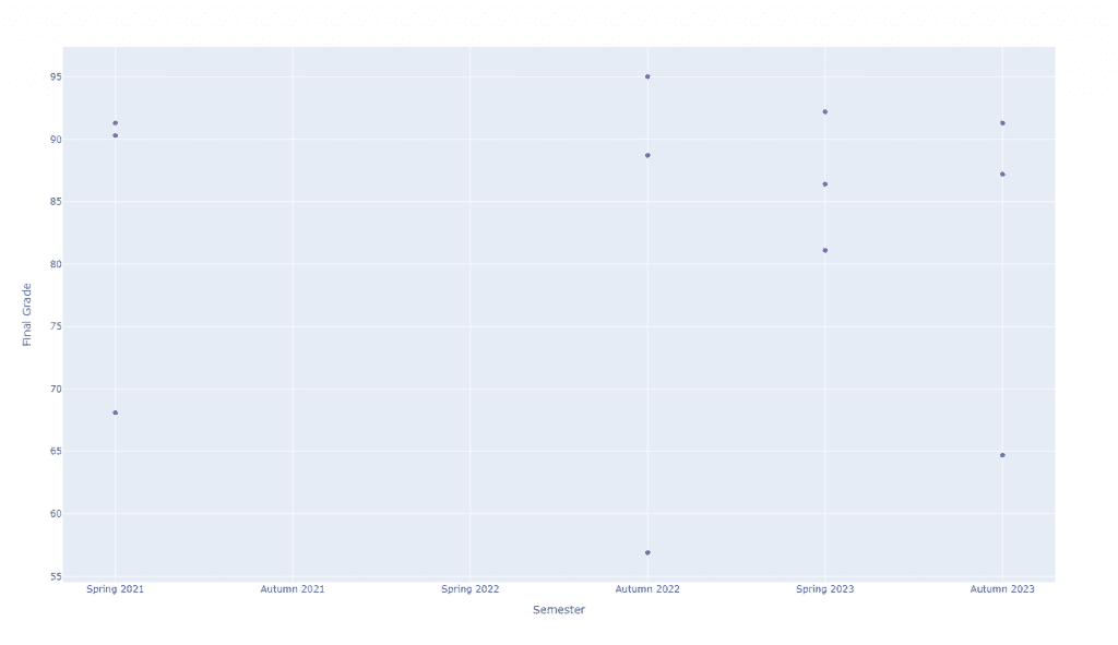
Clearly, there’s a gap between Spring 2021 and Autumn 2022 that is not showing up in the plot. The way that I solved this problem was by generating all of the possible season and year combinations from the existing data. This is much easier to do than you’d think. Here’s the code to do it:
import pandas as pd

data = pd.read_csv("data.csv")

semesters = list(pd.MultiIndex.from_product(
    data.set_index(["Year", "Season"]).index.levels
))

print(semesters)
This generates the following list:
[(2021, 'Autumn'), (2021, 'Spring'), (2022, 'Autumn'), (2022, 'Spring'), (2023, 'Autumn'), (2023, 'Spring')]
Unfortunately, this does require you to do a bit of sorting again, which has the same pitfalls. Here’s a handy function I wrote to handle at least Spring and Autumn.
def _semester_order(data: pd.DataFrame) -> list:
    """
    Returns a sorted list of semesters in the expected order
    (e.g., [Autumn 2018, Spring 2019, Autumn 2019, Spring 2020, ...]).

    It works by generating a multindex from all combinations
    of years and seasons. Then, we convert that multindex to
    a list of pairs, sort these pairs first by season then by
    year, and finally concatenate them together.

    :param data: the DataFrame provided by the user with an assumed Semester column
    :return: a list of sorted semesters
    """
    semesters = list(pd.MultiIndex.from_product(data.set_index(["Year", "Season"]).index.levels))
    semesters.sort(key=lambda x: x[1], reverse=True)
    semesters.sort(key=lambda x: x[0])
    semesters = [f"{item[1]} {item[0]}" for item in semesters]
    return semesters
When combined with the category_orders trick from before, we get the exact plot we asked for:
import pandas as pd
import plotly.express as px

def _semester_order(data: pd.DataFrame) -> list:
    """
    Returns a sorted list of semesters in the expected order
    (e.g., [Autumn 2018, Spring 2019, Autumn 2019, Spring 2020, ...]).

    It works by generating a multindex from all combinations
    of years and seasons. Then, we convert that multindex to
    a list of pairs, sort these pairs first by season then by
    year, and finally concatenate them together.

    :param data: the DataFrame provided by the user with an assumed Semester column
    :return: a list of sorted semesters
    """
    semesters = list(pd.MultiIndex.from_product(data.set_index(["Year", "Season"]).index.levels))
    semesters.sort(key=lambda x: x[1], reverse=True)
    semesters.sort(key=lambda x: x[0])
    semesters = [f"{item[1]} {item[0]}" for item in semesters]
    return semesters

data = pd.read_csv("data.csv")

data["Semester"] = data["Season"] + " " + data["Year"].astype(str)

data = data.sort_values(by="Season", ascending=False).sort_values(by="Year", kind="stable")

plot = px.scatter(
    data,
    x="Semester",
    y="Final Grade",
    category_orders={"Semester": _semester_order(data)}
)

plot.show()
And of course, here’s the resulting plot:
And that’s it!
Pitfalls and Future Concerns
As I mentioned in the opening, the solution I generated for plotting semesters of data seems to work wonderfully for me. Here are some example plots for context:
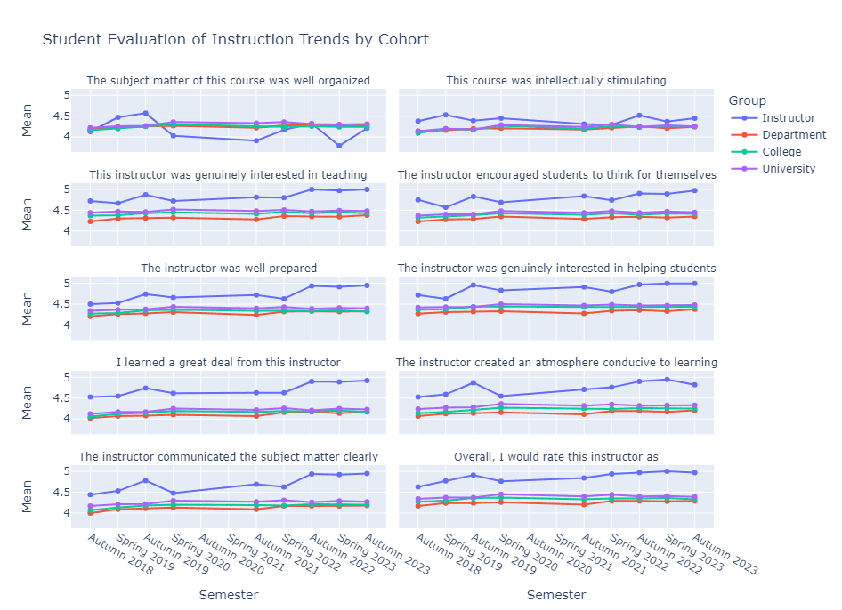
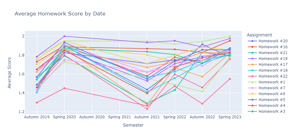
Overall, I am quite pleased with the results. However, I am worried about a couple of things going forward. First, the code as it stands does not support summer terms, so I will have to rework my code to support them. Second, I have a feeling that the x-axis will not automatically “fold” on itself when more semesters are added. Based on the SEI figure above, I fully expect all of the labels to start overlapping in a year or two. I think that is partially due to the categories not being true time-series, so there is no sample rate for the ticks.
As it stands, this solution is good enough for me. That said, I’ve been looking into trying to model the semesters as true time series. I’m thinking there must be a way to do it with Pandas “Periods” or some other time-series structure. However, I don’t want to have to store my data as dates again.
Regardless, it was nice to share my solutions with some folks! Hopefully, this goes a long way to having other folks share their solutions, so I don’t have to roll my own like this as often in the future. Though, Google is most likely to blame for how atrocious their search engine has gotten. You might never find this article yourself.
As always, thanks for sticking around. I’m not much of a data scientist, but I do dabble in data visualization. If you liked this, there are plenty more data viz style articles for you to check out:
- How to Use Python to Build a Simple Visualization Dashboard Using Plotly
- JuxtaMIDI: A MIDI File Visualization Dashboard
- How to Plot a Line Using Matplotlib in Python: Lists, DataFrames, and More
You’re also welcome to support the site a bit more by checking out my list of ways to grow the site. Alternatively, here are some Python resources (#ad):
- Effective Python: 90 Specific Ways to Write Better Python
- Python Tricks: A Buffet of Awesome Python Features
- Python Programming: An Introduction to Computer Science
Thanks again! Take care.
Recent Posts
Duolingo is a fun little app for picking up the basics of a new language, but you will never truly learn that language. Trust me! I've tried.
Hey, what can I say? Haven't I ranted about efficiency enough? Would you prefer I were more succinct or should I say "efficient" in my writing?

